Tuesday 22 November 2011

Arslan Shahid

Typeface created from triangular pieces of card. This is supposed to reflect war. It does feel pretty dark and painful.  Not sure how we could use this is our poster. Think it would take a huge amount of time to stick stuff onto it to make it 3D. Maybe cutting out and creating outward folds would be the best idea.


Julien Valee


Sarah Illenberger

Beautiful work. New approach to what might seem a pretty boring brief. But as this has been tackled in 3D, it makes takes the whole piece into another level. 3D is definitely the way forward for this D&AD brief!


Michael Velliquette

Wow... colour and 3d paper... bit crazy but definitely fun. The detail of the folds and look of 3D is immense but the colour is a bit too much I think for what we want.


Psyop

"To celebrate its 100th anniversary Converse has released a music video for My Drive-Thru featuring Pharrell Williams, N.E.R.D., Santogold, and Julian Casablancas. The video was created by Converse with partners including Anomaly, Cornerstone and the directing and animation talents of Psyop."


Geometric and type - STEPH

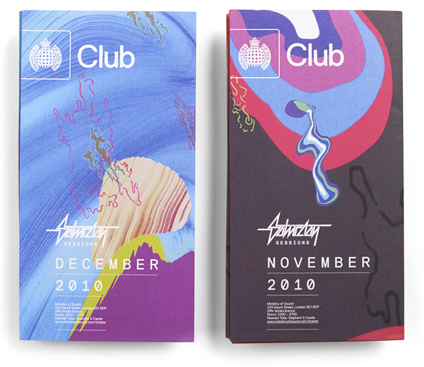
I cannot take credit for this research, this post is more about how well we are working together...

This issuu document was made by Steph and I LOVE IT! She has found some great stuff  to do with the style and how to add colour while I have been more focused on the folding techniques and process. We are working better together than I thought, not that I thought it would be bad, but just not as easy as it has been!

We are both on the same track and this has shown in all our decisions and research. We both have a similar idea on what sort of 3D experience we want to create and I thought I would re-blog one of her bits of research for my own reference.


Christopher Coppers

Making an everyday product into a 3D artwork is amazing! No more paper has been used than what is from the magazines. Absolutely love this!


Studio Output - MoS

Studio Outputs logo is on the MoS brief. I have again researched thee before but this is what they have done for MoS... mainly for Saturday Sessions. They like bright colours! This may be an aspect which we change from our original idea to be seen as more compatible with existing posters.


Monday 21 November 2011

Content

The content has been specified by D&AD for the Ministry of Sound brief.


Brief 04 version 04

Me and Steph got together today and rewrote the D&AD brief so that we can assess the problems and resolve them in an appropriate way.

We have decided to make the poster 3D as this will bring the experience closer to the audience. Also we do not need to shout about music or anything other than 'Saturday Sessions' as their audience is one who already attends the club nights and know about it.


Julene Harrison

So well hand-crafted. The typography ones are the most interesting to me,  but I really appreciate the time and craft that is put into each work!


Ersinhan Ersin


Atelier Pariri