Wednesday 29 September 2010

At the printers

Notes 1

Notes 3 & 4


Rotary printing see examples
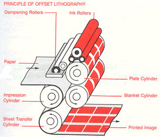
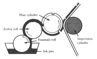
Offset Lithography (Litho) - etched alluminium plates are wrapped around a cylinder.
Rotogravure (Gravue) - Copper plates used, more refined and durable. Suitable for massive print runs.
Flexography (Flexo) - Polymer plate, not as good registration but ideal for plastic stock.

Digital printing see examples
RIP (Raster Image Processor) software is used and is good for small print runs (-500).

Screen Printing see examples
Automated machines for huge print runs. Lots of arms with lots of inks. Not just one screen used.

Pad printing see examples
Transfer of a 2D image onto a 3D object.

Rotary printing

Lithography (Litho/Offset Lithography)
  • Etched alluminium plates are wrapped around a cylinder. The image is transferred or 'offset' from one cylinder to another. 
  • Medium must be flexible as has to go through roller. 
  • Was invented in 1796 by Alois Senefelder as a low-cost method of publishing theatrical works. 
  • A basic principle of litho is that oil and water do not mix.


Principle of offset lithography


Rotogravure (Gravure)
  • More refined images because of a use of copper plates.
  • Expensive but more durable - can do huge runs.
  • denser ink coverage, can be used for floor coverings and also large magazine print runs.
Principle of gravure

I believe money is printed using the gravure process as there is a massive print run and impressive detail. This should also be printed in specially mixed colours to prevent replication. The stock would also be special paper and format. There are special finishes added to money such as embossing, metalic threading and UV inks. All of these specials and the high quality is needed otherwise they would be replicated. 


Flexography (Flexo)
  • Polymer plate used.
  • Registration is not as good as when using other methods of rotary printing (litho and gravure).
  • Different stocks can be used such as cellophane and plastics. 

Principle of flexo
This Ribena bottle is printed using Flexo. Printed onto plastic and then shrinked around bottle. Special spot colours have been used instead of CMYK, I could see purple, green, yellow, red, cyan and black. The stock is think plastic sheets which are easy to roll and shape. The plastic is perforated for an offer and this is a special finish applied to some prints. Due to the bright colours (achieved by special spot colours) this product is aimed at fun people. The competition is quite strong in this market and so the all over bright colours help this to stand out. 

Digital printing

Screen printing (large scale)

Pad printing

Monday 27 September 2010

Range

Warburtons
The Warburtons range. 

Warburtons began with Thomas and Ellen Warburton in 1870. Warburtons have their own farmers growing their own wheat. They believe these are the five ways in which they can improve
Managing the stewardship of our supply chain ethically and sustainably.
Minimising the impact of our business on the environment and helping to alleviate climate change.
Keeping our employees safe and well and giving them opportunities for learning and development.
Helping consumers make healthy and environmentally friendly choices.
Supporting charities, organisations and projects in the local community.

Baby, i'm back and I like bread

The 'good' workshop with Lorenzo opened up my mind into thinking more abstract about what is good. Over summer I picked something pretty rigid to research and I enjoyed learning about it, but from a purely selfish point. I didn't enjoy telling others what I had found and couldn't be persuasive in my argument. I have to think about things which people could see as reasons why something is not good and be able to argue my side more effectively. I also want to chose something which I can look at in different ways and compile my own primary research about.

I tried to make a list of 100 things I thought were good... then realised I think everything is good.


I think bread is good.
I chose bread because it is probably what I eat most of and HAVE to have it in my cupboard. There is so much variety of bread that there is something for everyone. Bread is just a word to use to collect all the doughy goodness together.

Tuesday 14 September 2010

Dan Tobin Smith

Oh my god. I love this guys work. It is amazing! ARGH! Ok... Calm...

My favourite pieces from his work are where he uses perspective to his advantage, creating images which are only truely visable in their entirety when viewed from a certain angle. He is currently working on producing an entire alphabet... I am seriously going to see if he has any need for an assistant if I have any time free. I would absolutely love to mix photography and typography!

Athlete

Jay-Z

Bela Borsodi

Photographer Bela Borsodi shot the word alphabets for WAD magazine. It is reminds me of the H I made in visual language. If these letters were viewed from any other angle, they would not make sense. I love it. I think the intelligence needed to create such a beautiful piece is good. Borsodis other work is pretty impressive too, see last image.

 A

P & S

Fashion

Stefan Sagmeister

Stefan Sagmeister expresses this statement with 3D typography by using money to illustrate this in Waagdragerhof Square in Amsterdam for Urban Play. I think this is good as it brought lots of people together. Some one tried to 'steal' the artwork once it was left for the public and in an effort to 'preserve' the artwork the police swept every remaining cent away. 

Over 100 volunteers helped set up the piece

Obsessions make my life worse and my work better

Clotilde Olyff

Olyff is a typographer and graphic designer. Over the past 20 years she has collected nearly 30 stone alphabets. These stones have been collected and look like letterforms to make up a complete collection. I think it is brilliant! I aim to do something similar myself and hopefully in the future I can have my own obscure, natural alphabet!

Stone alphabet

Aoyama Hina

Sentances are created by scissors. "The pieces are labour intensive - a short work will take up to five hours to make, while a long work could take up to three months. Hina says "I don't foillow tradition, but I am trying to create a mixture of the traditional and modern styles to product my own world through this style." - 3D typography.

Sentances

Monday 6 September 2010

Anna Garforth

Anna Garforth is quite clearly green fingered! Describing herself as an urban land artist, guerilla gardner and green graffiti extrodinaire. Her work is pretty amazing but I especially like this project with leaves... Her website is pretty nice too.


Rethink


Change


Releaf

Aaron Miller

I came accross this dude while working at Jigsaw. In one of the articles that went to press it mentioned a little non-profit project called Alphabits. 26 designers illustrating the 26 letters of the alphabet. Arron Miller creates vector illustrations mainly of character designs. I like his style but in a way there are quite alot of illuatrators doing similar stuff with vector character designs. Saying that, I do like his creativity with getting personality into his characters. I especially like his Alphabits contribution.

 Alphabits contribution

 Scholastic characters

Appfreak designed for App Freak website as a character who writes about iPhone and iPad apps